This graphic shows the annual global temperature anomalies dating back to 1880 (solid red line). The shaded bars show the anomalies per decade. As you can easily see, global temperatures have been increasing quite drastically since the late 1970s.

The global weather stories of the year? Mine are heat and hurricanes

El Niño combined with ongoing global warming to set yet another temperature record and also fuelled major hurricanes and typhoons

Reading Time: 3 minutes I figured I would begin our look back at 2015’s weather from a global perspective and then zoom into North America, Canada, and Western Canada in particular, in an upcoming article. I have to pretty much agree with the top two 2015 global weather stories that nearly every website has come up with — 2015 […] Read more

The year in numbers — a quick look back at 2015

The year in numbers — a quick look back at 2015

Two things stand out when reviewing data from across Alberta — 
it was a little drier than normal and consistently warmer
Reading Time: 2 minutes With the ending of one year and the beginning of a new one, we traditionally take a look back at what was and then look ahead to see what the new year might have in store for us. From a weather point of view there a number of ways we can do this — from […] Read more


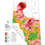
This map shows the total amount of precipitation that fell across Alberta during 2015, well almost. It covers the 365-day period ending on Dec. 15. 
You can see that overall, it was a fairly dry year, with parts of the southern, northern, and Peace River regions experiencing one-in-12-year to greater than one-in-50-year dryness. The wettest areas (green) only saw near-average amounts.

When Mother Nature goes to extremes, the consequences are massive

Whether it’s heat or cold, dry or wet, you can only hope 
these records will stand for a long, long time
Reading Time: 3 minutes Each year Environment Canada puts out its Top 10 weather stories and I like to go through them taking a more western focus. I thought it might be interesting to go back over the last 115 years or so and look at some of the biggest weather stories to hit the Canadian Prairies — according […] Read more

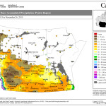
Normally around this time of year I put out the first snow cover map, but due to the light and variable amounts of snow received so far this year the map was basically a mess. Instead, I have gone with a map showing total precipitation during the 30-day period ending Nov. 26. While not all of this precipitation fell as snow, regions with the highest amounts currently have the deepest snow cover.

The weather outside hasn’t been frightful, nor has the snow come

It was a warm November across the Prairies, 
but especially in the Peace and Manitoba

Reading Time: 3 minutes I know I have promised to take a look at big snowfall events for a while now, but I kind of forgot that the end of the month was coming and that is typically when we do our look-back and look-ahead at our Prairie weather. Besides, the way the weather is going it doesn’t look […] Read more


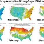
This graphic shows monthly temperature anomalies across the U.S. during strong El Niño years — blue/green indicates cooler-than-average temperatures while red/orange are for warmer-than-average temperatures. While the map doesn’t cover Canada, it is fairly easy to imagine or extrapolate the data northward to cover most of the southern and central Prairies. Looking at the different maps, what really jumps out are the well-above-average December temperatures across the northern states. These warmer-than-average temperatures look to continue right through to the end of winter.

Dreaming of a warm Christmas? El Niño may grant your wish

Winter is still winter, but history says the El Niño 
phenomenon brings above-average temperatures

Reading Time: 3 minutes After a fairly mild first half of November, things have turned cooler and a little more wintery. While it’s beginning to look like winter might have moved in for good, the long-range models seem to be really hanging their hats on El Niño bringing more above-average temperatures in December and right through the rest of […] Read more

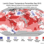
This map shows September’s global temperatures as percentiles ranging from record cold to record warmth. It’s easy to see just why it was one of, if not the, warmest September on record. With the exception of a few small areas of cooler to much cooler-than-average temperatures, most of the planet saw warmer to much warmer-than-average temperatures, with large areas seeing record warmth.

The latest winter outlook and more on cold weather precipitation

October was a pleasant change from September, but will the 
warmer-than-average weather continue for the rest of the year?

Reading Time: 3 minutes In my last article I said that we’d continue our discussion on cold weather precipitation. But before diving into that icy topic, I want to take a look at the weather so far this fall and see if the long-range winter forecasts have changed. After experiencing a cooler- and wetter-than-average September across pretty much all of agricultural […] Read more


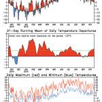
This graphic shows the departure from average for temperatures in Calgary over the last year. It is very similar to what you would find in locations across all of agricultural Alberta. The middle graph shows the 31-day running mean of daily temperatures, which helps to smooth out the data and shows the longer-term trends. You can see that, with the exception of a couple of very minor cool periods late last August and early September, temperatures have been running above average since last December.

The (super) cool lowdown on how snow is formed

Snow will soon begin to fall but a lot has to happen before 
clouds are ready to produce the white stuff


Reading Time: 3 minutes As we slowly work our way towards winter I thought it might be time to begin our look at the sometimes dreaded ‘S word’ — snow. Instead of just jumping straight into a discussion about snow I think we’ll take a bit of a slower approach that will hopefully help lessen the pain for some […] Read more

Why does El Niño have such a big impact on our weather?

Why does El Niño have such a big impact on our weather?

It’s all about heat and the atmosphere’s aversion to imbalances 
when it comes to hot and cold


Reading Time: 4 minutes A few weeks ago while waiting for a triathlon to start, a thunderstorm rolled through the region forcing everyone to run for shelter. While listening to people talk during the storm I overheard a weather-related idea or story that I’ve actually been mulling in my head for a while now, but I still haven’t figured […] Read more


Severe summer weather. Taking a look at thunderstorms and wind

Severe summer weather. Taking a look at thunderstorms and wind

Everyone knows what a funnel cloud looks like, but understanding how it forms isn’t easy

Reading Time: 3 minutes In continuing our look at severe thunderstorms, we’ll look at specifically, the most deadly part — tornadoes. What are tornadoes and how do they form? A classic definition of a tornado is a violently rotating column of air that extends from a thunderstorm to the ground, which may or may not be visible as a funnel cloud. For […] Read more

Keep watch: How to spot the warning signs of a tornado

Keep watch: How to spot the warning signs of a tornado

A dark area between the storm and the ground, a green tint to the sky, and a line of swirling clouds are all danger signs

Reading Time: 3 minutes This next topic in our look at different types of severe summer weather is severe thunderstorms, and in particular, high winds. When we think of severe thunderstorms one word that should make you worried and nervous is tornado. While tornadoes are the most destructive feature that can occur within a thunderstorm, they are fairly rare, with […] Read more