Morocco/Reuters – Almost 200 nations began work on Monday to turn promises for fighting climate change into action at a UN conference that played down threats to a 2015 global agreement if Republican Donald Trump wins the U.S. presidency. At the start of two-week talks in Morocco, many delegates wore badges with a smiling picture […] Read more

Ignoring Trump, UN talks seek to turn climate pledges into action

How to use the Prairie Climate Atlas
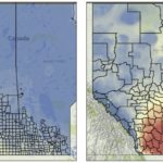
Reading Time: < 1 minute To use the atlas, go to climateatlas.ca and once the intro is done, click on the thermometer icon on the left-hand side of the page to bring up a map of the Prairies. Then click on Communities at the top of the page; select Municipal Zones from the drop-down menu; and use your cursor and […] Read more

Southern Alberta could soon have Texas weather
Want to see the climate projections for your county? New online atlas predicts a sweltering future
Reading Time: 5 minutes Western Canada is on an “inevitable” march towards hot, dry summers and mild winters that will make southern Alberta feel like northern Texas, according to a new climate change mapping program. “One of the big, striking conclusions of the atlas is that, even if we reduce emissions, we still see substantial changes to our climate,” […] Read more
Models cause for less hail, but less rain, too
Reading Time: < 1 minute Alberta has the dubious distinction of having the most — and biggest — hail in the world. “We’re very famous for that,” said University of Alberta meteorologist Gerhard Reuter. And you can blame it on the Rocky Mountains, which affect airflows to create ‘hail alley’ — a corridor stretching from Rocky Mountain House to Red […] Read more
